EDWARD MCKNIGHT KAUFFER
Edward McKnight Kauffer - known to his friends as Ted - was a gifted graphic designer, best known for his striking poster designs during the interwar years. Much of Kauffer’s success was enjoyed in Britain, but he was in fact born in Montana in 1890. Although he described his childhood as ‘lonely, nostalgic and uninspiring’ Kauffer developed a passion for painting. Whilst working in a bookshop in California in his early 20s, he befriended a professor named Joseph E McKnight, who generously offered to bankroll Kauffer’s study of art in Paris (it was in homage to this friend and patron that Kauffer adopted his surname!).
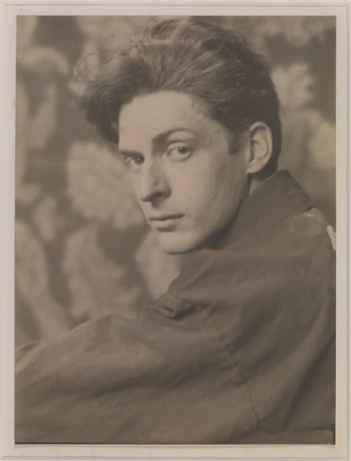
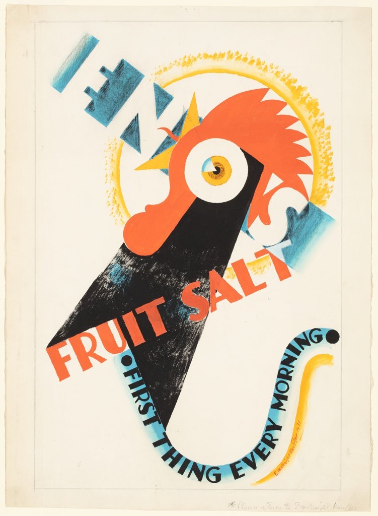
Left: E. McKnight Kauffer photographed by Maud B. Davis, c.1920. Right: Drawing for poster for Eno’s Fruit Salt, gouache on paper, 1931. Image courtesy of Cooper Hewitt.
Invitation for a viewing of spring furniture, fabrics and rugs at Fortnum and Mason, March 1936. Screenprint on card. Image courtesy of V&A.
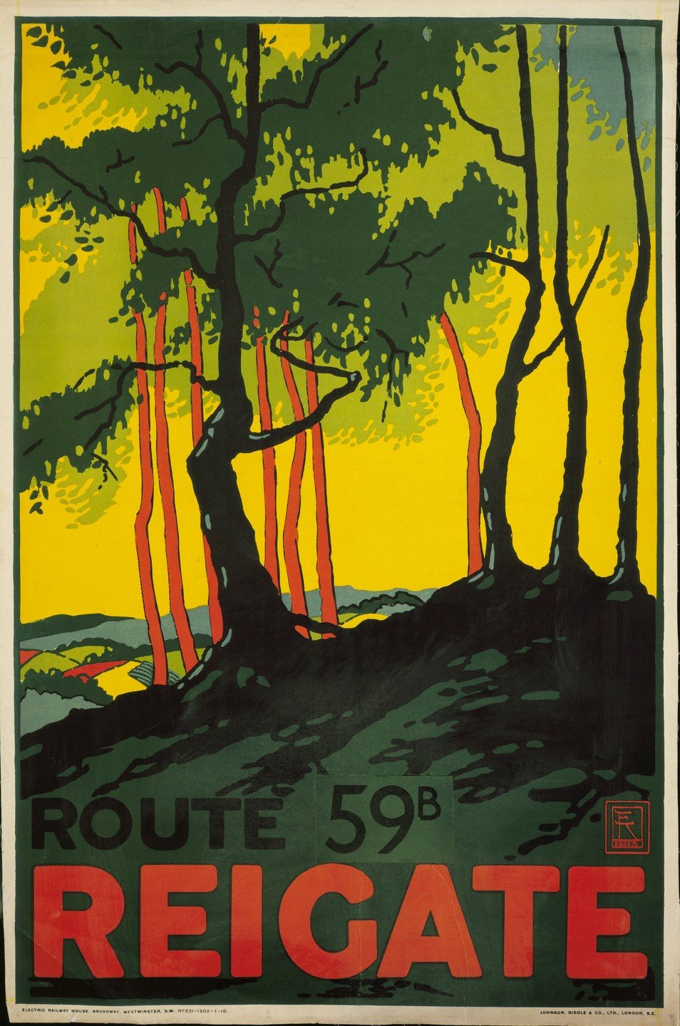
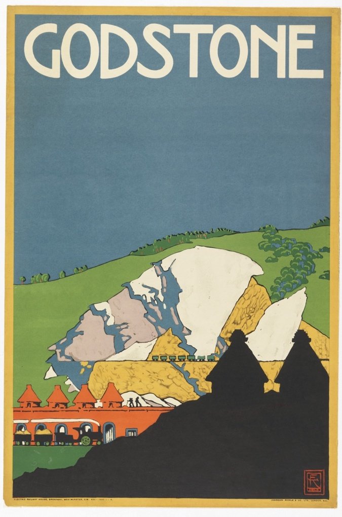
Kauffer enjoyed a short stint in Paris, studying at the Académie Moderne and absorbing the thriving modernist art scene. Although the First World War put paid to his studies, Kauffer’s drive was not diminished; he moved to London with his new wife Grace Ehrlich, in the hope of designing for advertising agencies. Luck would have it that he was introduced to Frank Pick, the progressive publicity manager of the London Underground. Pick recognised Kauffer’s talent and commissioned him to design several travel posters promoting the glorious London suburbs. Kauffer was an early pioneer of this style of travel poster, with its flat, bold use of colour, and helped popularise it for decades to come.
Travel posters designed for London Underground Electric Railways, litho printed, 1915. Images courtesy of Cooper Hewitt.
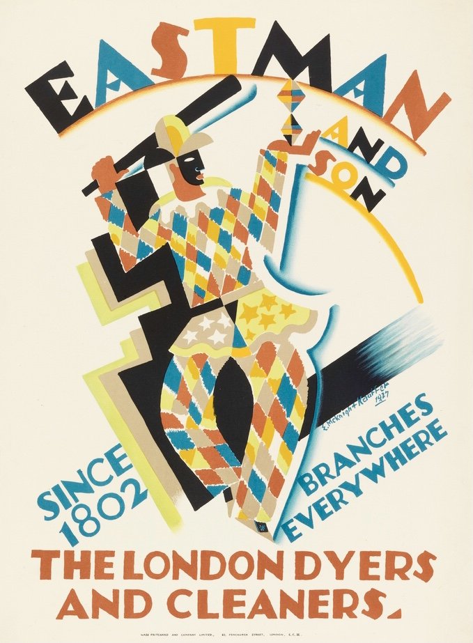
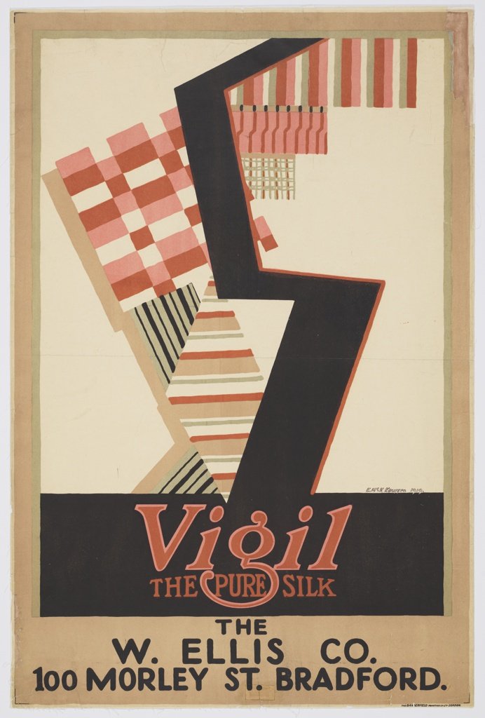
He garnered many more commissions from British brands, such as Shell, Fortnum and Mason, upmarket cleaning company Eastman’s, and Vigil Silk (owned by Alec Walker who went on to run Cryséde). His style is typified by the simple use of bold colour and geometric shapes, heavily influenced by Cubism and Vorticism. Most of designs were initially rendered in gouache, then reproduced using offset lithography, a method well suited to recreating the opaque, rich colour of his gouache paintings.
It’s easy to forget how radically modern these angular illustrations would have looked in the 1910s and 20s. The poster for Vigil Silk was even considered controversial at the time, due to its jagged severity. Britain was slow to adopt modernist styles by comparison with Europe, and I’m sure that Kauffer's time spent in Paris and Munich was formative in developing this style so early.
Left: poster for Eastman & Son cleaners, 1927.
Right: poster for Vigil Silk, 1919. Images courtesy of Cooper Hewitt.
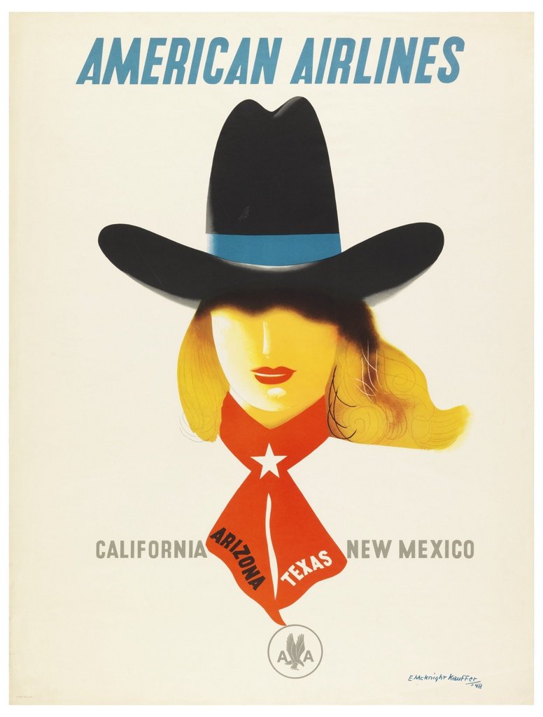
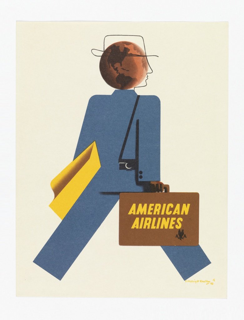
Not so admirably, Kauffer left his wife Grace and their daughter Ann after falling in love with fellow modernist designer Marion Dorn in 1923 (read my blog article about her here), and together they designed many beautiful rugs for Wilton Royal Carpet Co. With the outbreak of war, the couple returned to America in 1940, leaving behind all their work and somewhat starting over. Perhaps his biggest commission post-war was for American Airlines, for whom he designed over 30 posters, which wouldn't look out of place on Mad Men. In his book, Peyton Skipwith suggests that Kauffer’s dual nationality status diluted his legacy, saying ‘his posthumous reputation seems to have got stuck somewhere in mid-Atlantic’. But he is surely one of the great graphic designers of the 20th century, who paved the way for many modernist designers in Britain. The largest ever retrospective of his work is currently on show at the Cooper Hewitt Museum in New York, along with a brilliant looking book.
Ted Kauffer and Marion Dorn, mid-1920s. Simon Rendall Collection.
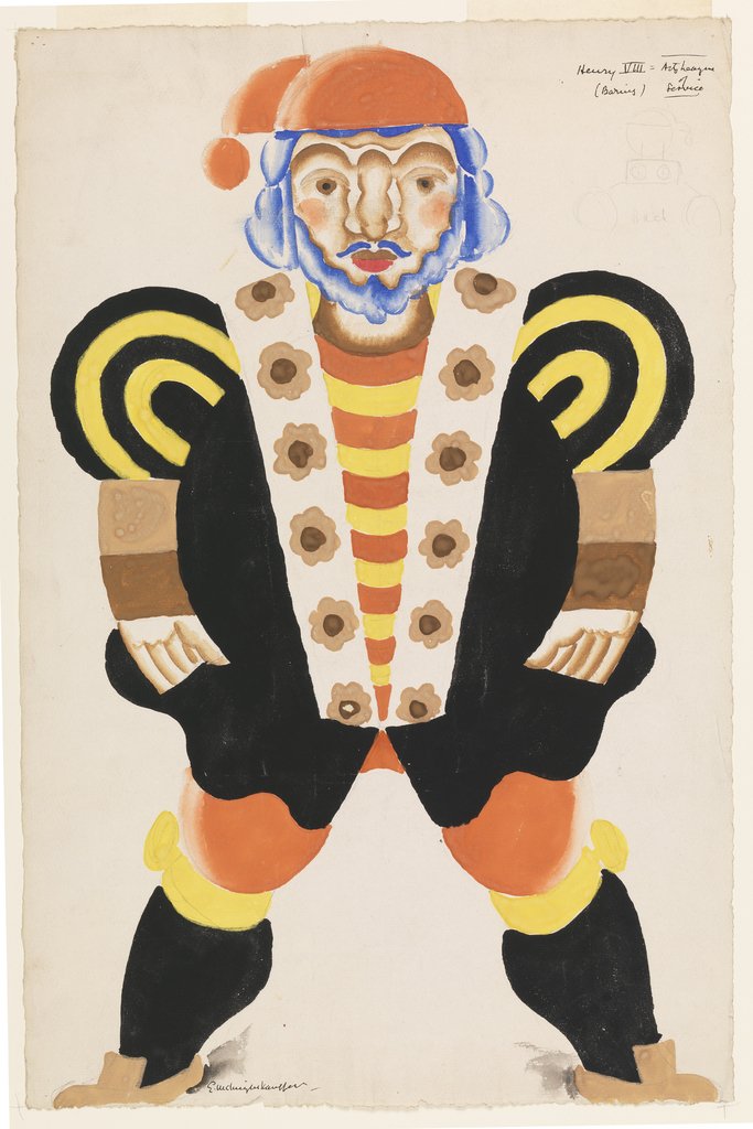
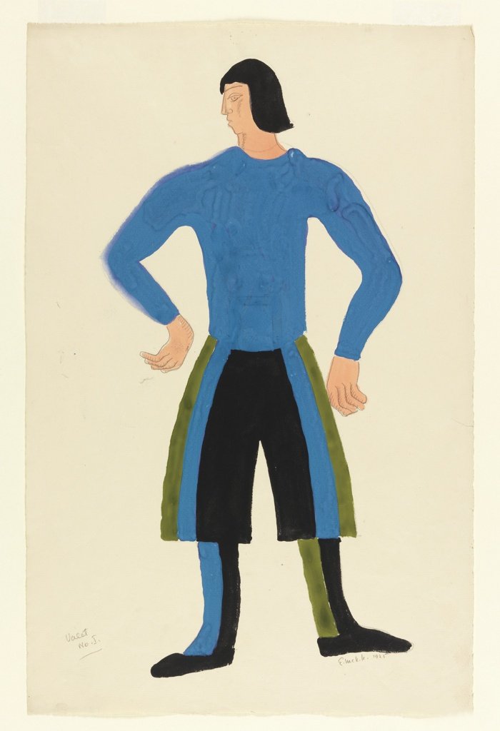
Drawings for costume designs for the play 'Catherine Parr, or Alexander’s Horse’ in 1925. The design on the left is a costume design for Henry VIII. Images courtesy of Cooper Hewitt.
Poster designed by Kauffer for the film Metropolis by Fritz Lang, 1926. Image courtesy of V&A.
Posters designed for American Airlines, 1948. Images courtesy of Cooper Hewitt.
